Begin with the decision the release measurement will inform
A launch dashboard should help a team make a decision. Otherwise, it can accumulate feature launch metrics without clarifying what action follows.
Post-release decisions may include:
- continuing or pausing a staged rollout;
- improving onboarding or in-product explanation;
- changing placement and discoverability;
- fixing a workflow, error, or prerequisite;
- expanding eligibility to another plan, role, or account segment;
- redesigning or removing the feature;
- targeting a specific customer cohort;
- investigating role or permission barriers.
Start by writing the decision in operational terms:
After [measurement window] of valid exposure,
we will use [primary adoption metric] and [guardrail metrics]
for [eligible entity and segment]
to decide whether to [release decision].For example:
After each eligible account has 28 days of exposure,
we will review recurring account adoption, delivery failures,
and user distribution to decide whether to expand the rollout,
change onboarding, or fix the setup workflow.This is more useful than declaring that success means “high usage.” It specifies the entity, opportunity, behavior, window, and action.
The threshold does not need to come from a universal SaaS benchmark. It can come from a prior comparable workflow, an internal baseline, a holdout, a product requirement, a capacity constraint, or a minimum level the team considers decision-relevant.
Define the release population before calculating adoption
The denominator is part of the product question. It should not automatically include every historical company or user in the database.
A useful post-release population model separates four groups.
| Population | Definition | Question it answers |
|---|---|---|
| Eligible | Accounts or users who could reasonably perform the intended workflow | Who had a legitimate opportunity to benefit? |
| Exposed | Eligible entities that actually received access or encountered the release | Who received the released experience? |
| Discovered | Exposed entities that reached, opened, or otherwise found the feature | Who found it? |
| Adopting | Entities that completed the predefined meaningful behavior | Who used it in the way that matters? |
Eligible population
Eligibility may depend on:
- pricing plan;
- user role;
- permissions;
- product configuration;
- prerequisite setup;
- account lifecycle;
- release date;
- region;
- application or product version;
- staged-rollout group;
- whether the account has the data, content, or workflow needed to use the feature.
An account with no reporting data is not necessarily eligible for a report-scheduling workflow. A user who can view a dashboard but cannot configure it is not necessarily eligible for an administrator setup action.
Eligibility should reflect a reasonable opportunity to perform the customer job, not merely the existence of an account record.
Exposed population
Exposure means the release was available to the entity under the measurement definition.
Depending on the product, exposure could mean:
- a feature flag was enabled for an account;
- the relevant application version became active;
- a role received the required permission;
- a user entered the product after enablement;
- an account joined a beta or staged-rollout group;
- the feature became available in a specific region.
Access and encounter are not always the same. A feature can be enabled for an account without any eligible user returning to the product. State clearly whether exposure means technical availability, first eligible Visit after enablement, or another observable condition.
Discovered population
Discovery means an eligible, exposed entity reached the feature or its entry point.
A page view may be a reasonable discovery signal. It is usually too weak to count as adoption.
Adopting population
Adopters complete the behavior defined as meaningful for the release. That may be one successful workflow, repeated use, downstream output, participation by multiple users, or another criterion connected to the feature’s intended value.
For the broader formula framework, link naturally to the verified version of how to calculate feature adoption rate. For choosing a qualifying action, link to the verified guide to meaningful feature use.
Use exposure date, not only the public launch date
A public launch date is useful for communication. It can be misleading as the analytical start date.
Exposure often varies because of:
- feature flags;
- staged rollout percentages;
- beta access;
- account-by-account enablement;
- role-based release;
- application-version adoption;
- regional availability;
- customer opt-in;
- a rollout paused and resumed over time.
If Account A received the feature on June 1 and Account B received it on June 18, comparing both through June 30 gives them different adoption opportunities. Account A had 30 days. Account B had 12.
For many analyses, align each entity by its actual exposure date:
Days since exposure
Days since exposure = observation date − entity’s valid exposure date
Then compare behavior during equivalent intervals such as:
Day 0–6 after exposure
Day 7–13 after exposure
Day 14–27 after exposureThis creates exposure cohorts rather than mixing early and late rollout groups into one calendar-period average.
Also define when a cohort is mature enough to enter the denominator. For a 28-day adoption window, an account exposed five days ago has not yet received a full opportunity. It can appear in operational rollout reporting, but it should not be treated as a 28-day non-adopter.
Define meaningful post-release adoption
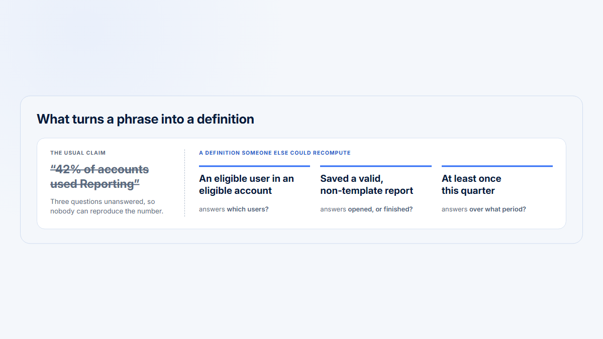
Every post-release adoption definition should state five things:
- Entity: account, user, team, workspace, or another unit.
- Eligibility: what makes that entity a legitimate candidate.
- Qualifying behavior: the event or workflow that represents value.
- Time window: how long the entity has to complete it.
- Recurrence rule: whether one completion is enough.
Use a compact measurement specification such as:
Entity:
Eligibility:
Exposure definition:
Qualifying behavior:
Measurement window:
Recurrence requirement:
Guardrails:
Comparison:
Priority segments:Examples differ by feature type.
| Feature type | Possible meaningful adoption definition |
|---|---|
| Administrator-owned setup | An eligible account completes configuration and a downstream operation succeeds within 14 days |
| Collaborative Reporting feature | An eligible account completes the workflow, repeats it in a later period, and has participation from more than one intended user where collaboration is expected |
| Manager dashboard | An eligible manager opens the dashboard and uses a decision-relevant control or follows through to the managed workflow |
| Specialist export tool | An eligible specialist completes a valid export; broad user penetration may not be expected |
| Recurring operational workflow | An eligible account completes the workflow in at least two distinct weekly periods |
| One-time migration | An eligible account completes migration and the migrated configuration functions correctly afterward |
A one-time setup feature should not be judged by weekly return. A recurring workflow should not be declared adopted from one exploratory click.
Build a post-release adoption funnel
A practical post-release funnel is:
Eligible → Exposed → Discovered → Started → Completed → Repeated → DistributedEach stage answers a different question.
- Eligible: Could the entity reasonably use the feature?
- Exposed: Did the entity receive access or the released experience?
- Discovered: Did the entity reach the feature?
- Started: Did it begin the intended workflow?
- Completed: Did it finish the meaningful action successfully?
- Repeated: Did it use the feature again at the required cadence?
- Distributed: Did adoption spread across the intended people or roles inside the account?
Use the same entity and a compatible measurement window throughout a funnel. Do not combine an account-level numerator with a user-level denominator.
Exposure rate
Exposure rate =
eligible entities exposed for the release
÷ eligible entities
× 100
Discovery rate
Discovery rate =
entities discovering the feature
÷ eligible exposed entities
× 100
Start rate
Start rate =
entities starting the workflow
÷ entities discovering the feature
× 100
Meaningful adoption rate
Meaningful adoption rate =
entities completing the qualifying behavior
÷ eligible exposed entities with a mature measurement window
× 100
Completion rate
Completion rate =
entities completing the workflow
÷ entities starting the workflow
× 100
Repeated-use rate
Repeated-use rate =
initial adopters meeting the recurrence rule
÷ initial adopters with enough follow-up time
× 100
Distributed-adoption rate
Distributed-adoption rate =
recurring adopters meeting the user-distribution rule
÷ recurring adopters
× 100
The measured entity may be an account or a user. Name it in the metric, such as meaningful account adoption, meaningful user adoption, or recurring account adoption.
Measure account adoption and user adoption separately
B2B feature adoption normally needs both an account view and a user view. For a fuller treatment of the distinction, link to the verified guide to account versus user adoption.
Account adoption answers:
How many eligible customer accounts adopted the feature?
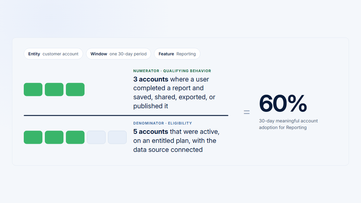
Account adoption
Account adoption =
adopting eligible accounts
÷ eligible exposed accounts
× 100
This is often the primary commercial and customer-level unit in B2B SaaS.
User adoption answers:
How many eligible people adopted the feature?
User adoption
User adoption =
adopting eligible users
÷ eligible exposed users
× 100
The user denominator should reflect the intended roles. Do not include every employee in the account when only administrators can perform the workflow.
User penetration answers:
How broadly did the feature spread inside accounts that adopted it?
User penetration
User penetration inside adopting accounts =
adopting users in adopting accounts
÷ eligible active users in those accounts
× 100
This distinguishes account reach from internal distribution.
Concentration answers:
Did one champion or specialist create nearly all usage?
A weighted concentration measure is:
Usage concentration
Top-user concentration =
qualifying actions performed by each account’s primary user
÷ all qualifying actions in adopting accounts
× 100
Also consider the median top-user share across accounts. A global weighted measure can be dominated by one large customer.
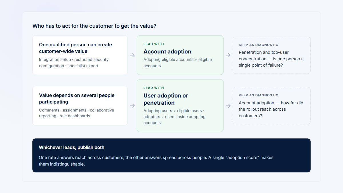
Concentration is not automatically bad. Interpret it against the feature’s intended ownership:
- An administrator-owned setup feature may be healthy with one primary user.
- A collaborative Reporting feature may require several participating users.
- A manager dashboard should be assessed among eligible managers.
- A specialist export tool may appropriately remain concentrated in an analyst or operations role.
Go beyond first adoption
First use answers whether the feature was tried. It does not show whether it became useful, reliable, recurring, or broadly adopted.
Useful post-launch product analytics can include:
| Metric | What it helps answer |
|---|---|
| Time to first meaningful use | How long does adoption take after exposure? |
| Workflow completion | Can discoverers finish the intended task? |
| Failure or error rate | Are attempts producing successful outcomes? |
| Active days | Is use spread across time or compressed into one exploration session? |
| Repeated use | Does the feature return at the workflow’s expected cadence? |
| Return after first use | Do initial adopters come back after the first attempt? |
| Usage depth | How many meaningful outputs or completed jobs occur per adopter? |
| User penetration | How broadly does use spread inside adopting accounts? |
| Top-user concentration | Is adoption dependent on one person? |
| Product-area breadth | Does the release expand adoption of the surrounding product area? |
| Account retention of feature use | Do adopting accounts continue using it in later eligible periods? |
| Existing-workflow effect | Does the feature replace, reduce, or complement an older workflow? |
| Customer-job outcome | Is the intended output delivered, completed, or maintained? |
Link naturally to the verified guide to product-area adoption when discussing breadth beyond one grouped page.
More activity is not automatically better. A release may increase Visits because users are repeatedly failing, returning to repair configuration, or checking whether an output worked. Pair activity with completion, successful output, recurrence, and relevant guardrails.
Choose a comparison method that matches the release
No single comparison design is suitable for every launch. Use the strongest practical design that matches how exposure occurred.
Equal-length pre/post comparison
Compare a post-release period with the immediately preceding period of equal length.
This can provide a simple directional view, especially for an existing workflow with a comparable prior metric.
Its limitations include:
- seasonality;
- an existing upward or downward trend;
- changes in account mix;
- marketing, onboarding, or customer-success activity;
- staggered exposure;
- unrelated product changes;
- different numbers of eligible opportunities in each period.
A pre/post difference shows that behavior changed. By itself, it does not show that the release caused the change.
Exposure-cohort comparison
Group accounts or users by exposure date and compare equivalent days or weeks since exposure.
This is useful when a release is staged, role-gated, version-dependent, or enabled account by account. It prevents recently exposed entities from being compared with entities that had much longer to adopt.
Holdout or randomized experiment
Where feasible, randomly assign eligible entities to exposed and unexposed groups, then compare predefined outcomes.
A well-implemented randomized experiment provides stronger causal evidence because assignment helps separate the release from pre-existing group differences. The experiment still needs trustworthy assignment, instrumentation, sample sizing, guardrails, and analysis.
For collaborative B2B features, account-level assignment may better match the unit of exposure than assigning different users inside one company to conflicting experiences.
Matched comparison group
When randomization is unavailable, compare exposed accounts with similar unexposed accounts based on observable factors such as:
- plan;
- account size;
- lifecycle;
- prerequisite completion;
- baseline product usage;
- prior Reporting adoption;
- region;
- role composition.
Matching can improve comparability. It cannot guarantee that the groups are equivalent. Unobserved differences may remain.
Interrupted time-series analysis
With enough observations before and after a clearly timed release, interrupted time-series analysis can compare the post-release level and trend with the pre-release pattern.
A credible analysis considers:
- the expected impact model defined in advance;
- existing trends;
- seasonality;
- autocorrelation;
- other changes near the release date;
- whether the release happened at one identifiable point;
- whether a comparison series is available.
This is stronger than comparing two arbitrary snapshots, but it does not make every release causal by default.
Qualitative comparison
Review successful and unsuccessful Visits from relevant accounts, roles, and funnel stages.
This helps generate explanations and identify visible workflow problems. It does not replace population-level measurement and should not be used alone to estimate how common a problem is.
Distinguish percentage change from percentage-point change
Use percentage change for counts or totals:
Percentage change
Percentage change =
(current − previous)
÷ previous
× 100
Use percentage-point change for the arithmetic difference between two rates:
Percentage-point change
Percentage-point change = current adoption rate − previous adoption rate
If adoption moves from 30% to 42%, the increase is:
Percentage-point increase
42% − 30% = 12 percentage points
The relative percentage increase is:
Relative percentage increase
(42% − 30%) ÷ 30% × 100 = 40%
Both are mathematically valid, but they answer different questions. State which one you mean.
Percentage change is undefined when the previous value is zero. It can also look dramatic from a tiny baseline. Moving from one adopter to three is a 200% increase, but the absolute change is two adopters. Always show the underlying counts when the population is small.
Match the measurement window to the workflow
A launch does not have one universal evaluation window.
Separate at least four kinds of time window:
| Window | Purpose |
|---|---|
| Immediate discovery window | Did exposed entities find the feature soon after release? |
| First-use window | Did they complete the first meaningful workflow? |
| Recurring-use window | Did initial adopters repeat at the intended cadence? |
| Maturation window | Did adoption spread, stabilize, or produce the intended downstream operation? |
The appropriate window depends on opportunity frequency.
- A daily operational workflow may show recurrence within several weeks.
- Monthly reporting needs at least one or more genuine monthly opportunities.
- Quarterly planning cannot be judged after 14 days.
- One-time configuration should be assessed through completion and downstream operation, not weekly return.
- A rare incident-management workflow may need opportunity-based measurement rather than calendar recurrence.
Include only entities that had the full required opportunity in mature-window rates. Keep newer exposure cohorts visible, but label them as still maturing rather than treating them as failed adopters.
Worked B2B release example: Scheduled Reports
A B2B SaaS company releases Scheduled Reports to selected Reporting accounts through a staged rollout.
The product team needs to decide whether to expand the rollout, change onboarding, or fix the setup workflow.
Measurement definition
The team defines the release before reviewing the results:
Primary entity:
Eligible customer account
Initial eligibility:
Active account on a qualifying plan,
with Reporting enabled and a user believed to have scheduling permission
Exposure:
Scheduled Reports enabled for the account through the rollout flag
Initial meaningful adoption:
At least one schedule configured and saved successfully
Primary recurring adoption:
At least two successful scheduled outputs
in distinct weekly periods within 28 days of exposure
User adoption:
An eligible user creates, edits, validates, or meaningfully manages a schedule
Distributed adoption:
More than one eligible user participates inside a recurring adopter account
Comparison:
A prior comparable email-delivery workflow,
plus exposure-aligned rollout cohorts
Guardrails:
Setup failures, output failures, and disruption to existing report deliveryRaw release funnel
The initial dashboard shows:
Illustrative example — not customer data
120 active accounts
80 initially classified as eligible
60 exposed during the staged rollout
42 discovered Scheduled Reports
30 started setup
24 completed and saved a schedule
18 received at least two successful scheduled outputs
12 recurring adopter accounts had more than one participating userFunnel calculations
Illustrative example — not customer data
| Metric | Calculation | Result |
|---|---|---|
| Exposure rate | 60 ÷ 80 × 100 | 75.0% |
| Discovery rate | 42 ÷ 60 × 100 | 70.0% |
| Start rate among discoverers | 30 ÷ 42 × 100 | 71.4% |
| Start rate among exposed accounts | 30 ÷ 60 × 100 | 50.0% |
| Completion rate | 24 ÷ 30 × 100 | 80.0% |
| Initial meaningful account adoption | 24 ÷ 60 × 100 | 40.0% |
| Repeated-use rate | 18 ÷ 24 × 100 | 75.0% |
| Primary recurring account adoption | 18 ÷ 60 × 100 | 30.0% |
| Distributed adoption among recurring adopters | 12 ÷ 18 × 100 | 66.7% |
The team should not summarize this as “70% adoption.” Seventy percent is discovery among exposed accounts. The stricter recurring account-adoption rate is 30%.
User adoption, penetration, and concentration
Across the 60 exposed accounts, there are 420 active users with roles initially considered eligible. Fifty-six users perform the qualifying user behavior.
User adoption
56 ÷ 420 × 100 = 13.3%
Inside the 24 accounts that completed a schedule, there are 200 eligible active users. The same 56 qualifying users participated.
User penetration inside completing accounts
56 ÷ 200 × 100 = 28.0%
The 24 completing accounts generated 180 qualifying Scheduled Reports actions. The primary user in each account generated 126 of them.
Top-user concentration
126 ÷ 180 × 100 = 70.0%
This shows why the account and user views should be reported together:
- 40% of exposed accounts completed the first meaningful action.
- 30% reached recurring account adoption.
- User penetration inside completing accounts was 28%.
- Primary users generated 70% of qualifying actions.
The feature reached multiple customer accounts, but usage remained concentrated. Whether that is a problem depends on whether Scheduled Reports is intended to be administrator-owned or collaborative.
A page-view spike did not produce more completions
After the team adds an in-product announcement, Scheduled Reports page Visits rise from 90 in one 14-day interval to 168 in the next equal-length interval.
Percentage change in page Visits
(168 − 90) ÷ 90 × 100 = 86.7%
Completed schedules remain at 12 in each interval.
The announcement appears to have increased feature traffic without increasing completed setup. That shifts the next question from reach to workflow progression:
- Did the added visitors understand the feature?
- Did they have the required permission?
- Were prerequisites missing?
- Did they start and encounter errors?
- Was the announcement shown to people who were not legitimate users of the workflow?
This is why page views are a discovery metric, not a release-success metric.
The eligibility audit changes the denominator
The lifecycle breakdown reveals that 10 of the 18 onboarding accounts in the exposed group did not have a verified report recipient or a completed Reporting data source. They could reach the screen, but they could not reasonably complete the intended workflow.
The initial eligibility rule was too broad.
After the team corrects it:
Corrected eligibility
Corrected eligible accounts = 80 − 10 = 70
Corrected eligible exposed accounts = 60 − 10 = 50
The corrected exposure rate becomes:
Corrected exposure rate
50 ÷ 70 × 100 = 71.4%
The corrected recurring account-adoption rate becomes:
Corrected recurring account adoption
18 ÷ 50 × 100 = 36.0%
The team should not silently replace the original result. It should document that the eligibility definition changed, restate the metric, and use the corrected definition consistently in subsequent comparisons.
This does not merely make the percentage look better. It changes the question from “What share of technically exposed accounts adopted?” to “What share of accounts with a real opportunity adopted?”
Segment breakdown
The following segment rows are separate analytical cuts and therefore overlap. Do not add the rows across dimensions.
Illustrative example — not customer data
| Segment | Exposed accounts | Recurring adopters | Recurring adoption | Interpretation |
|---|---|---|---|---|
| Established accounts | 42 | 17 | 40.5% | Stronger adoption after prerequisites were already in place |
| Onboarding accounts | 18 | 1 | 5.6% | Ten accounts were not truly workflow-eligible |
| Administrator-owned accounts | 36 | 15 | 41.7% | Permission and ownership matched the setup workflow |
| Manager-owned accounts | 24 | 3 | 12.5% | Discovery was higher than completion; permissions need review |
| Business plan | 24 | 10 | 41.7% | More prerequisite Reporting use was already present |
| Growth plan | 36 | 8 | 22.2% | Lower prerequisite completion and more setup gaps |
| Up to 20 eligible users | 34 | 12 | 35.3% | Account adoption was relatively strong |
| More than 20 eligible users | 26 | 6 | 23.1% | Internal distribution and ownership were less clear |
These cuts generate hypotheses. They do not prove that plan, size, lifecycle, or role caused the difference. The groups may differ in several ways at once.
Comparison with a prior workflow
In a comparable pre-release cohort, 13 of 60 eligible accounts repeatedly used the older email-delivery workflow.
Previous recurring adoption
13 ÷ 60 × 100 = 21.7%
Scheduled Reports reaches 18 of 60 accounts in the initial exposed population:
Current recurring adoption
18 ÷ 60 × 100 = 30.0%
The adoption-rate difference is:
Adoption-rate difference
30.0% − 21.7% = 8.3 percentage points
The relative change in adopter count is:
Relative change in adopter count
(18 − 13) ÷ 13 × 100 = 38.5%
The team can accurately say that recurring adoption was 8.3 percentage points higher than the comparable prior workflow in these periods. It should not say Scheduled Reports caused an 8.3-point lift unless the comparison design justifies that claim.
Account mix, rollout targeting, onboarding state, seasonality, and concurrent changes may also contribute.
Selected Visit evidence
The team then selects Visits from specific funnel stages rather than watching random recordings:
- discovered but did not start;
- started but did not complete;
- completed successfully;
- returned for repeated use;
- administrator and manager roles;
- established and onboarding accounts;
- accounts from early and late exposure cohorts.
In the fictional review sample:
- several manager Visits reach the scheduling screen but encounter a permission boundary;
- some onboarding Visits start setup before a recipient or data source is ready;
- successful administrators often enter from an existing report detail page rather than the general Reporting navigation;
- repeated users return through report-management paths rather than the original announcement.
These observations suggest permission, prerequisite, and placement questions worth testing across the population. The recordings do not establish how common each issue is by themselves.
Release decision
The team does not reduce the release to “successful” or “failed.”
A reasonable next decision is:
- continue rollout for established, administrator-ready accounts;
- correct the eligibility definition;
- delay or redesign exposure for onboarding accounts without prerequisites;
- clarify manager permissions and ownership;
- improve the path from discovery to setup;
- monitor a fully matured 28-day cohort after the changes;
- retain cautious language about the observed pre/post improvement.
Use cohorts and segments to locate the pattern
Global release averages can hide substantial differences between B2B customer groups.
Useful post-release cohorts and segments include:
- exposure week;
- plan;
- role;
- account size;
- lifecycle or onboarding stage;
- use case;
- prerequisite completion;
- current product-area adoption;
- new versus existing customers;
- region;
- application version;
- release variant;
- account owner or customer-success segment where relevant.
Segment by factors connected to the release hypothesis. Do not slice the data repeatedly until every cell is too small to interpret.
Keep the raw numerator and denominator visible. A 50% adoption rate based on two accounts means something different from a 50% rate based on 200 accounts.
When many segment comparisons are explored after seeing the data, treat the results as hypotheses for follow-up rather than definitive effects.
Measure displacement of the existing workflow
A new feature may replace or redistribute existing behavior.
Examples include:
- Scheduled Reports reducing manual exports;
- a unified dashboard reducing Visits to several older pages;
- automation reducing visible UI interaction;
- a new workflow moving actions from the client to the server;
- a bulk action replacing many repeated individual actions.
A decline in an older metric may be an intended result rather than product harm.
Measure the customer job across old and new paths. For example:
Total successful report deliveries
Total successful report deliveries =
successful manual deliveries
+ successful scheduled deliveries
− duplicate deliveries
Also inspect quality and failure guardrails. A reduction in manual exports is only helpful if scheduled delivery succeeds and customers can manage the workflow.
Do not optimize one event count while ignoring that the release changed where or how the job occurs.
Use session evidence to explain the release pattern
Aggregate product release analytics should identify which Visits are worth reviewing.
Select evidence intentionally:
| Visit group | Investigation question |
|---|---|
| Discovered but did not start | Was the value unclear, irrelevant, or permission-gated? |
| Started but did not complete | Where did the workflow stop? |
| Completed successfully | What path and prerequisites supported success? |
| Returned for repeated use | How did recurring users re-enter the workflow? |
| Different roles | Did ownership and permissions match the design? |
| Different account segments | Did the same workflow behave differently by context? |
| Before and after release | Did visible behavior change alongside the metric? |
Session evidence is best used to inspect visible behavior, generate explanations, and choose the next measurement or design change.
It should not be used to claim that a problem affects the full population merely because it appeared in one or several recordings. Link naturally to the verified guide comparing session replay and product analytics.
Turn the funnel pattern into a release decision
Use the location of the drop-off to decide what to investigate next.
| Observed pattern | Likely investigation |
|---|---|
| Low exposure | Rollout configuration, eligibility, permissions, application version, or release delivery |
| High exposure, low discovery | Placement, communication, navigation, relevance, or whether exposure was defined too loosely |
| High discovery, low start | Clarity, perceived value, role ownership, permissions, or missing prerequisites |
| High start, low completion | Workflow friction, validation, errors, required setup, or confusing states |
| High completion, low recurrence | Workflow cadence, output value, follow-up path, reliability, or whether one-time use is expected |
| High account adoption, low user penetration | Role concentration, collaboration design, training, or whether broad participation is intended |
| High activity, high concentration | Champion dependency, specialist ownership, or one large account dominating the aggregate |
| Strong adoption, worsening guardrail | Failures, performance, support burden, displaced workflows, or unintended downstream effects |
The table is a diagnostic guide, not an automatic root-cause system. Each pattern narrows the next question; it does not supply the answer by itself.
Common post-release measurement mistakes
- Measuring only page views. Page views show reach or discovery, not completion, value, or recurrence.
- Using every historical account as the denominator. Inactive, ineligible, wrong-plan, wrong-role, or unconfigured accounts can make adoption appear artificially weak.
- Starting every window from one public launch date. Staged rollout and version adoption give entities different exposure opportunities.
- Defining success after seeing the data. Post hoc definitions make it easy to select the metric that tells the preferred story.
- Ignoring prerequisite setup. A technically exposed account may not have a genuine opportunity to complete the workflow.
- Measuring users when the customer decision is account-level. A feature can reach many users inside a few accounts without broad customer adoption.
- Measuring accounts without inspecting user distribution. One champion can make an account appear healthy while the rest of the intended team never adopts.
- Using a window that is too short. Monthly or quarterly workflows need real opportunities to occur.
- Treating an event spike as retained adoption. Announcements and novelty can create temporary traffic without recurring value.
- Comparing unequal periods. A 30-day total and a 14-day total are not directly comparable without normalization and opportunity context.
- Confusing percentage change with percentage points. A rate moving from 30% to 42% rises by 12 percentage points and 40% relative to the previous rate.
- Attributing every post-release change to the feature. Seasonality, account mix, onboarding, campaigns, support activity, and other product changes may also matter.
- Ignoring displaced workflows. A successful automation feature may reduce the old UI metric by design.
- Reviewing only failed Visits. Successful Visits reveal workable paths, prerequisites, and role patterns.
- Declaring success from one large account. Show account distribution and concentration so one customer does not dominate the narrative.
- Changing the qualifying event during the comparison. Restate historical data consistently or label the definition break explicitly.
How Hymetry connects release adoption to account and session evidence
Hymetry helps B2B SaaS teams connect product usage across Pages, Companies, Users, and Visits.
For post-release analysis, that investigation path can be:
Release metric
→ adopting and non-adopting companies
→ contributing or missing users
→ relevant VisitsA product team can begin with a grouped page or product area in Pages, compare the current period with the previous period, and inspect which customer accounts used it. From there, the team can review adoption breadth, user distribution, and the people contributing to the pattern. Selected Visits provide session-level evidence for deeper investigation.
This account-centric path is particularly useful for product teams because a B2B customer is normally a company containing several people, roles, and workflows. A global user total cannot show whether adoption reached many accounts, spread inside them, or depended on one champion.
Teams still need to define:
- who was eligible;
- when exposure occurred;
- what behavior counts as meaningful;
- whether recurrence is required;
- which comparison method is appropriate;
- how long each account needs to mature.
Hymetry should not be presented as automatically detecting releases, assigning experiments, or establishing causality. Its role is to connect aggregate adoption signals to the account, user, page, and Visit evidence available for human review.
A practical post-release measurement checklist
Before interpreting a feature release, confirm that the team can answer:
Measurement questions
- What decision will this measurement inform?
- What entity is being measured?
- Who is genuinely eligible?
- What counts as exposure?
- When was each entity exposed?
- What behavior counts as meaningful adoption?
- Is one use enough?
- What is the appropriate follow-up window?
- Are account and user metrics reported separately?
- How will user penetration and concentration be measured?
- What existing workflow may be displaced?
- What baseline, cohort, holdout, or comparison is available?
- Which guardrails could reveal harm or failure?
- Which Visits will be sampled to investigate the pattern?
- What language does the design support: change, association, or causal effect?
A reliable release readout does not need dozens of metrics. It needs a small number of well-defined metrics that preserve the population, opportunity, behavior, timing, and evidence behind the decision.
Frequently asked questions
What is the best metric for measuring feature adoption after launch?
There is no single best metric for every feature. Start with meaningful account adoption for the eligible, exposed population, then add user adoption, recurrence, completion, penetration, concentration, and guardrails according to the workflow. A page view or event count alone is rarely sufficient.
What is a good feature adoption rate after a product release?
There is no universal adoption benchmark that applies across features, plans, roles, workflows, and customer populations. Compare the release with a relevant internal baseline, prior workflow, exposure cohort, control group, or product requirement. Always show the qualifying behavior and denominator.
Should the adoption denominator include all customers?
Usually not. The denominator should include accounts or users that were genuinely eligible and had a valid opportunity to use the feature. Eligibility may depend on plan, role, permissions, configuration, prerequisites, lifecycle, region, version, or rollout group.
How do staged rollouts change feature-adoption measurement?
Staged rollouts give accounts or users different exposure dates. Align cohorts by days or weeks since exposure and include only entities with a mature observation window in completed-window rates. A single public launch date can unfairly classify late-exposed entities as non-adopters.
Can a pre/post comparison prove that a release caused adoption to increase?
Not by itself. A pre/post comparison can show a change, but seasonality, existing trends, account mix, onboarding, campaigns, and other product changes may also contribute. A correctly implemented randomized holdout provides stronger causal evidence. Matched groups and time-series methods can improve inference but rely on assumptions.
How should a one-time setup feature be measured?
Measure successful completion and the downstream operation the setup is meant to enable. Weekly return may be irrelevant. For example, a configuration feature may count as adopted only after setup is saved and the configured process succeeds.
Should B2B teams measure accounts or users?
Usually both. Account adoption shows customer reach. User adoption and penetration show how many intended people participate inside those accounts. Concentration shows whether the pattern depends on one administrator, champion, manager, or specialist.
How can session replay help after a release?
Use aggregate metrics to select relevant Visits, then inspect successful and unsuccessful behavior at specific funnel stages. Session evidence can reveal visible paths, errors, permission boundaries, and workflow confusion. It should not be used alone to estimate prevalence or prove causation.
Sources
- Practical guide to controlled experiments on the web: listen to your customers not to the HiPPO — Ron Kohavi, Randal M. Henne, and Dan Sommerfield; ACM.
- Online controlled experiments at large scale — Ron Kohavi, Alex Deng, Brian Frasca, Toby Walker, Ya Xu, and Nils Pohlmann; ACM.
- Progressive experimentation with feature flags — Microsoft Learn, Azure DevOps.
- Remote Config rollouts — Firebase documentation.
- Release a version update in phases — Apple Developer, App Store Connect Help.
- [GA4] Cohort exploration — Google Analytics Help.
- [GA4] Funnel exploration — Google Analytics Help.
- Interrupted time series regression for the evaluation of public health interventions: a tutorial — James Lopez Bernal, Steven Cummins, and Antonio Gasparrini; International Journal of Epidemiology.
- Inferring causal impact using Bayesian structural time-series models — Kay H. Brodersen, Fabian Gallusser, Jim Koehler, Nicolas Remy, and Steven L. Scott; Google Research.
- Matching methods for causal inference: A review and a look forward — Elizabeth A. Stuart; Statistical Science.
- Percentages and percentage points — Office for National Statistics Content Style Guide.
- Why 5 Participants Are Okay in a Qualitative Study, but Not in a Quantitative One — Raluca Budiu; Nielsen Norman Group.