Baseline, benchmark, cohort, and peer group are different
These terms are often used interchangeably, but they answer different questions.
| Term | Practical definition | Example |
|---|---|---|
| Baseline | A reference value used to interpret a metric. | The account’s previous-period value, a peer median, a project-wide distribution, an expected product cadence, or a predefined operational target. |
| Benchmark | A reference based on a broader set of organizations, products, or datasets. | An external report comparing product engagement across many companies. Its definitions may not match yours. |
| Cohort | A group sharing a starting event or time-based condition. | Accounts onboarded in May, customers activated in the same quarter, or users whose first session occurred in the same week. |
| Peer group | Accounts considered comparable for a specific analytical question. | Mature enterprise collaboration accounts with Reporting access and weekly expected use. |
A baseline does not have to be external. An account’s own previous 30 days can be a baseline. So can the median of comparable accounts.
A benchmark is normally broader. External account usage benchmarks may be useful for orientation, but two vendors can use the same metric name with different events, denominators, eligibility rules, time windows, and sampling methods.
A cohort is commonly tied to time or a shared entry condition. Official analytics documentation, for example, describes cohorts as groups sharing a characteristic such as the same first-session date.[7][8] Cohorts are particularly useful for onboarding and retention questions because all members begin from a comparable event.
A peer group is question-specific. Atlas Labs might be compared with recently onboarded enterprise accounts when evaluating time to first meaningful use, with mature collaboration accounts when evaluating active-user penetration, and with other admin-heavy accounts when evaluating top-user concentration. One permanent peer label cannot answer every question.
Why global averages mislead in B2B SaaS
People searching for B2B SaaS peer benchmarks often expect a universal table of good and bad values. The deeper problem is usually not the absence of a benchmark. It is that the accounts being averaged were never comparable.
A global account population can mix:
- startup and enterprise customers;
- newly onboarded and mature accounts;
- different plans and product access;
- administrator-owned and collaborative use cases;
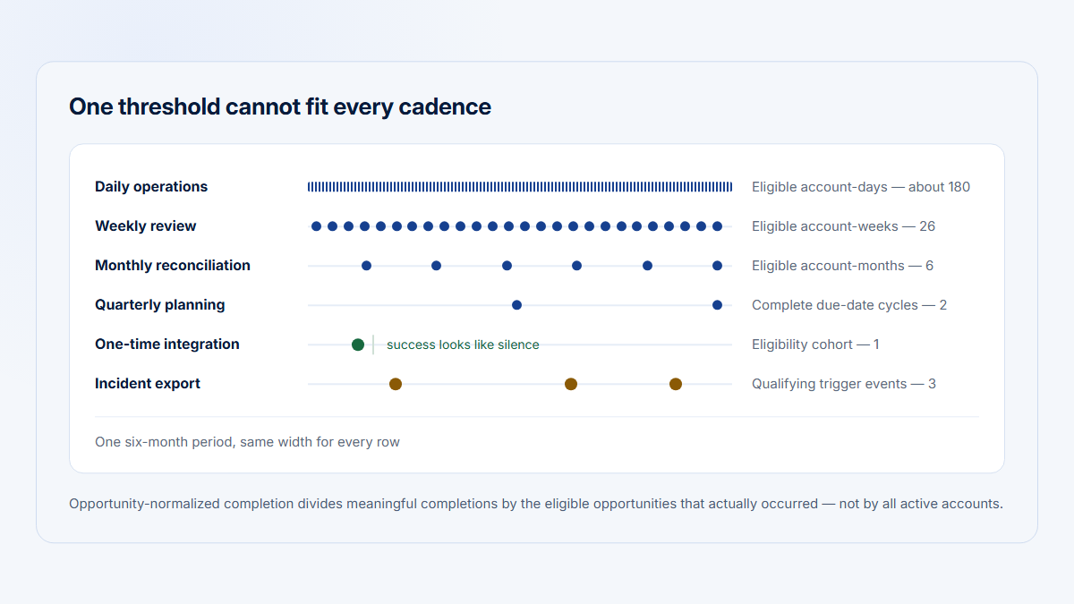
- daily operational workflows and monthly reporting workflows;
- accounts with 10 eligible seats and accounts with 1,000;
- optional product areas and mandatory workflows;
- accounts that completed setup and accounts that could not yet use the capability.
The resulting average can be mathematically correct and operationally misleading.
A 1,000-seat enterprise account can dominate a pooled user total. A mature account with broad product access can pull the average above what an onboarding account could reasonably achieve. A daily workflow can make a monthly process look inactive. An optional specialist capability can appear underused when the denominator includes customers that never bought or configured it.
The aggregation problem is not only theoretical. Relationships visible in a combined population can differ from relationships within relevant subgroups, a long-established statistical interpretation risk associated with aggregation.[10]
Consider two accounts:
- An enterprise account has 100 active users out of 1,000 eligible seats.
- A specialist account has five active users out of five people who are supposed to use the workflow.
The enterprise account has 20 times as many active users. That does not automatically make it healthier. Its active-user penetration is 10%, while the specialist account has complete participation among the people for whom the workflow is relevant. Even that comparison remains incomplete until the team checks role expectations, product access, workflow value, and cadence.
This is why measuring product usage by company requires account context rather than a company name attached to a user total.
Select the metric before selecting peers
Peer construction depends on the metric. Start with the decision, choose the metric that represents that decision, and only then decide which accounts are comparable.
| Metric | What it can help answer | Eligibility or normalization to consider |
|---|---|---|
| Active users | How many people participated? | Account size, eligible seats, role mix, and whether raw count or participation rate is the real question. |
| Active-user penetration | What share of eligible people used the product? | A reliable eligible-user or seat denominator and comparable role expectations. |
| Feature user penetration | How broadly did a workflow spread inside an account? | Users eligible for the feature, feature access, and a qualifying-use definition. |
| Account adoption breadth | How many relevant product areas did the account use? | Product areas available and applicable to the account. |
| Meaningful actions | How much qualifying work occurred? | A vetted event definition, duplicate handling, automation exclusions, and opportunity count where relevant. |
| Active days | How regularly did the account return? | Timezone, period length, expected cadence, and seasonality. |
| Visits or sessions | How many distinct periods of use occurred? | Session boundaries, automated traffic exclusions, and whether repeated sessions indicate value or recovery from failure. |
| Observed engaged time | How much observed active product time occurred? | Idle rules, capture coverage, workflow complexity, and account scale. |
| Top-user concentration | How much activity depended on one person? | Enough eligible active users for concentration to be meaningful and a suitable activity measure. |
| Recurring feature use | Did the workflow become repeated behavior? | Feature access, qualifying use, expected recurrence, and enough elapsed time. |
| Time to first meaningful use | How quickly did the account reach a defined milestone? | A known onboarding start, equivalent setup requirements, and comparable onboarding cohorts. |
Raw active users often require account-size context. A rate such as active-user penetration can reduce that scale problem, but only when the denominator is valid.
Feature user penetration already normalizes use inside an account:
Feature user penetration =
eligible active users who used the feature
÷ eligible active users in the account
× 100
Time to first meaningful use is different. It should normally compare accounts that began onboarding under similar conditions. A mature-account peer group is irrelevant to an onboarding-duration question.
Top-user concentration has another constraint. A value based on two active users is coarse and unstable. A high concentration value can also be normal for an administrator-owned or specialist workflow.
The metric determines which dimensions matter. It also determines directionality: a higher completion rate may be encouraging, while a higher error rate or concentration value may require review.
Choose peer dimensions that plausibly influence the metric
Potential peer-group dimensions include:
- plan or product access;
- account size or eligible seats;
- lifecycle stage;
- account age;
- onboarding status;
- use case;
- relevant product configuration;
- role mix;
- industry, where product behavior genuinely differs;
- region, where process, regulation, language, or product availability changes behavior;
- expected cadence;
- enabled integrations;
- contract type, when it changes product access or expected use.
Do not add a dimension merely because it is available.
Every matching variable should have a plausible relationship to the metric or its opportunity to occur. Industry may matter for a regulated workflow with genuinely different process requirements. It may add noise to a generic dashboard-usage comparison. Region may matter when a capability is unavailable in one market. It should not automatically become part of every peer definition.
A useful peer definition is written as a sentence before it becomes a filter:
Mature enterprise collaboration accounts with Reporting access, at least 90 days since onboarding completion, 100–500 eligible seats, and an expected weekly-or-more-frequent workflow.
That sentence makes assumptions reviewable. “Similar customers” does not.
Prefer normalization when it removes an unnecessary dimension
Exact size bands are not always necessary. A well-defined rate can sometimes compare scale more cleanly than splitting accounts into many narrow bands.
For example:
Active-user penetration =
active eligible users
÷ eligible seats or eligible users
× 100
A rate does not eliminate all size effects. Ten percent in a 10-seat account and 10% in a 1,000-seat account can have different operational implications. It does, however, reduce the direct domination caused by raw counts and may allow a broader, more stable peer group.
Apply eligibility before peer comparison
A peer baseline cannot repair an invalid denominator.
Before an account enters a peer distribution, confirm that it:
- could access the capability;
- completed required setup where relevant;
- had a realistic opportunity to use it;
- was active in the relevant product context;
- was measured over a comparable period;
- was not excluded by test, staff, demo, automation, or data-quality rules.
Suppose Reporting is available only on certain plans. Including accounts without Reporting access in a Reporting-adoption baseline lowers the apparent norm without measuring customer behavior. It measures product entitlement.
Suppose an integration must be connected before a workflow becomes usable. Accounts that have not completed the integration may belong in an onboarding analysis, but not in a recurring-use peer distribution.
Suppose one account was observed for 30 complete days and another for four. Comparing their total active days without normalizing the opportunity window creates a false difference.
Eligibility belongs before segmentation, calculation, and interpretation:
Valid comparison population
→ relevant peer dimensions
→ leave-one-out peer set
→ distribution and account position
If the eligible population is wrong, a precise percentile only gives false confidence.
Use medians, percentiles, and distributions deliberately
B2B account usage is often skewed. A small number of large or highly active accounts can sit far above the rest of the population.
NIST’s statistical guidance explains that the mean is pulled toward skew and can be distorted by extreme values, while the median is based on rank and is less affected by extreme tails.[1] That does not make the median universally superior. It makes the choice part of the analytical method.
Median
The median is the middle value after peer values are ordered.
For an odd number of observations:
Median = middle ordered peer value
For an even number:
Median =
the mean of the two middle ordered peer values
The median is useful when a few very large accounts produce a long right tail. It describes a central peer position without giving an extreme account disproportionate influence.
Percentiles
Percentiles show where a value lies within an ordered distribution. Common reference points include:
- 25th percentile;
- 50th percentile, or median;
- 75th percentile;
- the compared account’s percentile rank.
A 75th-percentile value is high relative to the peer distribution. It is not automatically better.
For engaged time, a high percentile could represent deep productive work or a difficult workflow. For top-user concentration, a high percentile may indicate that activity depends on unusually few people. For time to first meaningful use, a high duration percentile means the account took longer than most peers.
Different software packages use different sample-quantile interpolation methods. The differences are especially visible in small groups.[2][5] Choose one method, document it, and use it consistently across the interface, exports, tests, and historical calculations.
For illustrative account ranking, this article uses a midrank convention that handles ties:
Percentile rank =
(number of peer values below the account value
+ 0.5 × number of peer values equal to the account value)
÷ peer count
× 100
The compared account is excluded from the peer count.
Interquartile range
The interquartile range, or IQR, spans the middle half of the distribution:
IQR = 75th percentile - 25th percentile
NIST describes the IQR as a measure focused on the middle portion of the data.[3]
Showing the 25th percentile, median, and 75th percentile gives the reader more context than a median alone. An account can sit slightly below the median while remaining comfortably inside the middle half of relevant peers.
Mean
The mean can still be useful where:
- the distribution is reasonably symmetric;
- extreme accounts are not distorting the result;
- the weighting method matches the question;
- totals genuinely need to be pooled;
- the interface shows enough distribution context to interpret it.
Peer mean =
sum of peer values
÷ peer count
Be explicit about weighting. These are not the same:
Unweighted mean of account rates =
sum of each account's rate
÷ number of accounts
Pooled rate =
sum of all qualifying numerators
÷ sum of all qualifying denominators
The unweighted mean gives each account equal influence. The pooled rate gives larger denominators more influence. Either can be defensible, but they answer different questions.
Relative difference from the peer median
For a metric with a meaningful nonzero peer median:
Relative difference from peer median =
((account value - peer median)
÷ peer median)
× 100
A result of -10% means the account value is 10% below the peer median relative to that median.
This calculation is undefined when the peer median is zero and unstable when it is close to zero. In that case, show an absolute difference, a percentage-point difference for rates, the distribution itself, or an unavailable state.
Percentage-point difference
For rates, percentage points are often clearer:
Difference in percentage points =
account rate - peer median rate
An account at 40% penetration compared with a 42% peer median is 2 percentage points below the median. It is not “2% lower.”
Standardized scores
A z-score describes distance from a peer mean in standard-deviation units:
z-score =
(account value - peer mean)
÷ peer standard deviation
It can be useful when there are enough observations and the mean and standard deviation describe the distribution sensibly.
It should not be the default for a small, heavily skewed B2B account population. Skewness and heavy tails can make mean-and-standard-deviation summaries difficult to interpret.[1][4] A standardized value can look scientific while hiding weak assumptions.
Exclude the account from its own baseline
When comparing a company with its peers, normally exclude that company from the distribution used as its reference.
This is a leave-one-out comparison:
Peer set for account i =
all eligible matched accounts
excluding account i
Without leave-one-out calculation, the account can shift its own median, quartiles, mean, and percentile reference. The effect may be small in a large population but material in a small group.
Consider an illustrative group with peer values of 20, 40, and 80. The peer median is 40. If the compared account has a value of 90 and is incorrectly added to its own baseline, the four-value median becomes:
Incorrect median including the account =
(40 + 80) ÷ 2
= 60
The account shifted its own reference from 40 to 60.
Leave-one-out comparisons also make the methodology easier to explain: “This account is compared with seven other eligible accounts,” rather than “This account is one of the eight values defining its own baseline.”
Small peer groups need visible fallback rules
There is no universal minimum number of accounts that makes every peer comparison valid.
The acceptable count depends on:
- the decision being made;
- the stability of the metric;
- the shape of the distribution;
- the number of tied values;
- how quickly the population changes;
- whether a percentile, median, or broad range is being shown;
- the consequences of acting on the result.
A small group can still provide useful descriptive context. It should not be presented with more precision than the data supports.
The interface and methodology should expose:
- the peer count;
- the peer definition;
- the distribution;
- the fallback level;
- an insufficient-data state.
A transparent fallback hierarchy can be:
- Exact relevant peer group Match the dimensions required by the metric and decision.
- Broader lifecycle-and-plan peer group Remove a less important dimension while preserving lifecycle and access.
- Broader eligibility-matched group Preserve the ability and opportunity to use the capability, but relax additional segmentation.
- Project-wide eligible population Compare with all accounts that could reasonably produce the metric.
- No peer comparison Show insufficient data when no broader group is defensible.
The fallback should be visible in the result:
Peer median: 42%
7 peers
Fallback: lifecycle + plan
Exact use-case peers unavailable
Do not silently change “mature enterprise collaboration accounts” into “all active customers.” The number may remain on the screen while its meaning changes completely.
Avoid over-segmenting until every account is unique
Peer design has an unavoidable tradeoff:
- Narrow peers increase relevance.
- Broad peers increase stability.
Matching on plan, exact seat band, lifecycle month, industry, region, use case, contract type, integration set, role distribution, and product configuration may leave one or two accounts in every group. The analysis then describes identities rather than a reusable comparison population.
Several approaches can manage the tradeoff.
Use hierarchical fallback
Begin with the narrowest defensible peer definition and broaden it one documented dimension at a time. Preserve dimensions tied directly to access and opportunity longer than descriptive attributes with a weaker relationship to the metric.
Normalize broadly before segmenting narrowly
Rates per eligible user, eligible account, opportunity, or complete period can reduce the need for exact size bands.
Normalization does not solve every contextual difference, but it can produce a more stable comparison set than raw totals.
Match only on the most relevant dimensions
Ask of every dimension:
Could this attribute plausibly change the account’s ability, opportunity, or expected pattern for this metric?
If the answer is unclear, do not include it by default.
Consider model-based expected values only for advanced implementations
Regression or other statistical models can estimate an expected value while accounting for several variables. They may be useful when the dataset is sufficiently large and the model is validated.
They should not become an opaque default. An advanced implementation should disclose:
- input variables;
- training population;
- update timing;
- expected value;
- residual or difference;
- uncertainty;
- fallback behavior;
- known limitations.
A transparent median and IQR from a defensible group are often more actionable than an unexplained model score.
Report uncertainty instead of hiding it
Small populations produce coarse percentile ranks. With seven peers, moving past one peer changes the basic rank by about 14 percentage points. An interface can show “above 3 of 7 peers” beside “43rd percentile” to make that coarseness visible.
False precision is not removed by adding decimal places.
Previous-period and peer baselines answer different questions
An account’s previous period and its peer distribution should not be treated as substitutes.
Previous-period baseline
This asks:
Is this account changing relative to itself?
Examples include:
- active-user penetration increased from 31% to 40%;
- Reporting adoption fell by 8 percentage points;
- active days declined from 12 to 7;
- concentration moved from 38% to 61%.
Peer baseline
This asks:
Is this account unusual relative to comparable accounts?
Examples include:
- penetration is inside the peer IQR;
- breadth is below most mature plan peers;
- concentration is typical for specialist accounts;
- onboarding duration is longer than similar new customers.
A useful view may show both.
| Peer position | Previous-period movement | Possible interpretation |
|---|---|---|
| Below peers | Improving | The account remains behind comparable customers but is moving in a constructive direction. |
| Above peers | Declining | The account still looks strong relative to peers, but its own momentum is softening. |
| Typical | Stable | The account is behaving within the expected peer range. |
| Unusual | Explained by role or cadence | The difference may be structurally appropriate rather than a health problem. |
This distinction also matters for a customer health score. Peer position can be one component of context, but it should not erase the account’s own trajectory or become a deterministic churn label.
Worked example: five fictional B2B accounts
The following data is entirely illustrative. The companies, values, peer groups, and interpretations are fictional and are not Hymetry customer results or universal B2B SaaS benchmarks.
Assume a product has five product areas: Core workspace, Projects, Reporting, Administration, and Integrations. Not every account has access to or needs every area.
The main observation period is 30 complete days.
Illustration only
| Account | Plan and size | Lifecycle and use case | Expected cadence | Active users | Active-user penetration | Relevant product-area breadth | Active days | Reporting context | Top-user concentration |
|---|---|---|---|---|---|---|---|---|---|
| Atlas Labs | Enterprise, 240 eligible seats | Mature collaboration account | Weekly or daily | 96 | 40% | 4 of 5 | 18 | Adopted; 28% of active users used it | 21% |
| Northstar Works | Enterprise, 300 eligible seats | Six weeks into onboarding | Setup and adoption milestones | 30 | 10% | 2 of 5 | 12 | Setup still in progress | 52% |
| Beacon Systems | Specialist, 10 eligible seats | Mature administrator-owned workflow | Weekly | 5 | 50% | 1 of 2 relevant areas | 8 | Not included in its product access | 68% |
| Meridian Group | Enterprise, 1,000 eligible seats | Mature broad collaboration account | Daily | 620 | 62% | 5 of 5 | 26 | Adopted; 48% of active users used it | 9% |
| Harbor Analytics | Growth, 50 eligible seats | Mature monthly reporting use case | Monthly | 18 | 36% | 2 of 3 relevant areas | 3 | Adopted; 72% of active users used it | 34% |
For this example:
Active-user penetration =
active users
÷ eligible seats
× 100
Atlas Labs therefore has:
96 ÷ 240 × 100 = 40%
The mixed global mean gives Atlas the wrong context
Across only these five displayed accounts, raw active users are:
96, 30, 5, 620, 18
The global mean is:
Global mean active users =
(96 + 30 + 5 + 620 + 18)
÷ 5
= 153.8
Atlas has 96 active users, so it appears below the global mean.
But Meridian Group contributes 620 users and pulls the mean upward. The global median is only 30. Atlas is above that value. The same account looks below one global reference and above another.
Neither result answers whether Atlas has appropriate participation for a mature enterprise collaboration account.
The weighting method also changes the penetration reference.
The unweighted mean gives every account equal influence:
Unweighted mean penetration =
(40% + 10% + 50% + 62% + 36%)
÷ 5
= 39.6%
The pooled rate weights accounts by eligible seats:
Pooled penetration =
(96 + 30 + 5 + 620 + 18)
÷ (240 + 300 + 10 + 1,000 + 50)
× 100
= 48.1%
Atlas is slightly above the unweighted account mean but 8.1 percentage points below the pooled rate. The 1,000-seat Meridian account has much more influence on the pooled result.
The calculation is not broken. The question is underspecified.
Atlas is typical among relevant peers
For Atlas, define the comparison question as:
Is active-user penetration unusual for a mature enterprise collaboration account with the same product access and weekly-or-more-frequent expected use?
After excluding Atlas, the seven matched peer values are:
34%, 36%, 39%, 42%, 45%, 48%, 52%
Using the project’s documented quartile method, the summary displayed for this fictional example is:
- peer count: 7;
- peer median: 42%;
- middle peer range: 36%–48%;
- Atlas value: 40%;
- percentage-point difference:
40% - 42% = -2 percentage points; - percentile rank: approximately 43rd percentile.
The relative difference from the peer median is:
((40 - 42) ÷ 42) × 100
= -4.8%
The percentile rank calculation is:
Values below Atlas = 3
Values equal to Atlas = 0
Peer count = 7
Percentile rank =
(3 + 0.5 × 0)
÷ 7
× 100
= 42.9%
Atlas is below the mixed raw-user mean but inside the middle half of its relevant peer distribution. “Typical for this peer group” is a more defensible interpretation than “underperforming.”
That still does not prove Atlas is healthy. The team should inspect which roles participate, which product area remains unused, whether concentration is changing, and whether the account is improving relative to its prior period.
Northstar belongs with onboarding accounts
Northstar Works has 10% active-user penetration. Comparing it with Atlas’s mature-account median of 42% would make it look severely behind.
Northstar is only six weeks into onboarding, and Reporting setup is incomplete. Its relevant question is:
Is participation unusual for enterprise accounts at a similar onboarding stage with equivalent setup requirements?
Assume six leave-one-out onboarding peers have penetration values of:
5%, 7%, 9%, 11%, 13%, 15%
Northstar’s comparison is:
- peer count: 6;
- peer median: 10%;
- middle peer range: approximately 7%–13%;
- Northstar value: 10%;
- percentile rank: 50th percentile.
Northstar is typical for this onboarding cohort even though it is far below mature-account peers.
That does not mean onboarding is successful. The correct next question is whether Northstar is reaching the required milestones at an appropriate pace. Time to first meaningful use, setup completion, invited-user activation, and product-area sequence may be more useful than mature-account breadth.
Beacon’s concentration is high for collaboration but normal for its use case
Beacon Systems has five active users, 50% active-user penetration, and 68% of meaningful actions produced by its top user.
A broad collaboration baseline could label 68% concentration as fragile. Beacon, however, uses a specialist administrator-owned workflow. Only two product areas are relevant, and one or two people are expected to perform most actions.
Assume five comparable specialist peers have top-user concentration values of:
54%, 60%, 65%, 71%, 78%
Beacon’s comparison is:
- peer count: 5;
- peer median: 65%;
- middle peer range: approximately 60%–71%;
- Beacon value: 68%;
- percentile rank: 60th percentile.
Beacon is somewhat above its peer median but remains within the middle range for the relevant role structure.
The result should not be ignored. The team may still need continuity or backup coverage. It should be interpreted using the account’s specialist use case rather than a collaboration target. See the related guide on champion concentration risk for the distinction between an appropriate specialist owner and a fragile single-person dependency.
Meridian is unusually broad, but higher is not automatically healthier
Meridian Group has 62% active-user penetration.
When Meridian is excluded, seven mature enterprise collaboration peers have:
34%, 36%, 39%, 40%, 42%, 45%, 48%
Its comparison is:
- peer count: 7;
- peer median: 40%;
- middle peer range: approximately 36%–45%;
- Meridian value: 62%;
- position: above all seven displayed peers.
Using the illustrative rank convention, the numeric percentile would be 100th. An interface may communicate this more honestly as “above all 7 peers,” because a small peer set does not justify the implication of population-level precision.
Meridian’s broad participation is notable. It is not proof of customer health or a target every enterprise account should reach. The team still needs to know whether activity reflects meaningful workflows, whether errors or repeated attempts are rising, and whether the account’s own trend is stable.
Harbor needs a monthly window
Harbor Analytics has only three active days in 30 days. Its team performs a monthly reporting workflow, so clustered use is expected.
Assume six comparable monthly-reporting peers have:
2, 2, 3, 3, 4, 5 active days
Harbor’s comparison is:
- peer count: 6;
- peer median: 3 active days;
- middle peer range: approximately 2–4 days;
- Harbor value: 3 active days;
- percentile rank: 50th percentile.
A seven-day baseline could show zero activity depending on where the account sits in its reporting cycle. That would be expected cadence, not necessarily underuse.
This is the distinction explored in underused feature versus low-frequency workflow: absence inside a short window is not equivalent to failure to adopt a workflow whose natural cycle is longer.
The five comparisons summarized
Illustration only
| Account | Metric and question | Leave-one-out peer definition | Peer count | Median and middle range | Account position | Defensible interpretation |
|---|---|---|---|---|---|---|
| Atlas Labs | Active-user penetration for mature collaboration accounts | Same enterprise access, mature lifecycle, collaborative use, weekly-or-more cadence | 7 | 42%; 36%–48% | About 43rd percentile | Typical despite being below the mixed raw-user mean. |
| Northstar Works | Active-user penetration during onboarding | Enterprise accounts at a similar onboarding stage and setup state | 6 | 10%; about 7%–13% | 50th percentile | Typical for onboarding; mature-account comparison is invalid. |
| Beacon Systems | Top-user concentration in specialist use | Mature specialist/admin-owned accounts with equivalent access | 5 | 65%; about 60%–71% | 60th percentile | Concentrated, but not unusual for the use case. |
| Meridian Group | Active-user penetration for mature collaboration accounts | Same access, lifecycle, collaboration model, and cadence | 7 | 40%; about 36%–45% | Above all 7 peers | Unusually high participation, not a universal target or health proof. |
| Harbor Analytics | Active days for monthly Reporting | Mature monthly-reporting accounts with the same capability | 6 | 3 days; about 2–4 | 50th percentile | Typical monthly cadence; a seven-day baseline would mislead. |
Higher is not always better
A peer baseline must preserve the meaning and direction of the metric.
| Metric | A higher value may indicate | What still requires interpretation |
|---|---|---|
| Meaningful completion rate | More successful completion | Whether the event really represents customer value and whether eligible opportunities are correct. |
| Friction or error rate | More failed attempts or problems | Instrumentation quality, severity, recoverability, and workflow context. |
| Top-user concentration | Greater dependency on one person | Whether the workflow is naturally specialist-owned and whether backup coverage is needed. |
| Observed engaged time | Deep work or sustained activity | Difficulty, waiting, repeated correction, account scale, and capture rules. |
| Visits | Habitual use or frequent return | Repeated failure, interrupted workflows, session boundaries, and automation. |
| Active days | Consistent use | Natural cadence, seasonality, and whether activity is meaningful. |
| Time to first meaningful use | A longer onboarding duration | Setup complexity, account size, required milestones, and whether lower is preferred. |
A percentile only describes relative position. It does not supply directionality.
An account at the 90th percentile for successful recurring completion may deserve a different interpretation from an account at the 90th percentile for errors. An account at the 90th percentile for engaged time may require product and Visit evidence before the team knows whether that value reflects depth or difficulty.
The same principle applies to user engagement statuses. A label should be explained by visible behavior and context rather than treated as a psychological judgment.
Treat external SaaS benchmarks cautiously
External benchmarks can help a team learn which metrics or distributions other organizations report. They should not be imported as universal product-usage targets.
Before using an external B2B SaaS peer benchmark or customer engagement benchmark, check:
- the exact metric definition;
- the numerator and denominator;
- the time window;
- the product category;
- customer and account size;
- the eligible population;
- geography;
- sampling and weighting method;
- data recency;
- whether the source is promotional;
- whether the benchmark uses accounts, users, workspaces, or pooled events;
- whether customers could access and use the measured capability.
Google Analytics’s public benchmarking documentation, for example, presents peer context through a median and 25th and 75th percentiles.[6] That is a useful distribution-display pattern. It is not evidence that Google’s peer definitions or web-property metrics are appropriate B2B account usage benchmarks for another product.
An external source may define an active user by one type of event, while your product defines meaningful account use through a completed workflow. It may pool all customers across plans or weight results by traffic. It may represent marketing websites rather than identified, multi-user SaaS accounts.
Do not turn a proprietary vendor benchmark into a universal standard without compatible methodology and a defensible mapping to your own data.
A practical peer-baseline process
Use this process when designing an account usage benchmark or customer health peer comparison.
1. State the decision
Write the operational question before choosing the metric.
Examples:
- Which mature accounts need an adoption review?
- Is Reporting participation unusual for this account?
- Is onboarding progressing at a typical pace?
- Is product use becoming concentrated around one person?
2. Choose the metric
Select the measure that represents the decision. Do not begin with whichever field is easiest to query.
3. Define eligibility
Specify who could access the capability, what setup was required, what opportunity window applies, and which traffic is excluded.
4. Identify dimensions likely to influence the metric
Choose dimensions with a plausible relationship to access, opportunity, expected behavior, or interpretation.
5. Build the narrowest defensible peer group
Use the minimum set of dimensions needed to make the accounts comparable.
6. Exclude the compared account
Calculate a leave-one-out distribution so the account does not shift its own baseline.
7. Show the distribution
Display the median, peer count, 25th and 75th percentiles, and account position where useful. Do not reduce the comparison to one unexplained label.
8. Apply an explicit fallback when necessary
Broaden the group through a documented hierarchy. Display which level was used.
9. Compare with the account’s own previous period
Show whether the account is changing, not only whether it differs from peers.
10. Inspect product, user, and Visit evidence
Trace the account-level metric to relevant product areas, grouped pages, contributing users, and sessions.
11. Validate whether the peer definition remains useful
Review whether peers still share the assumptions that made the comparison defensible. Product access, lifecycle definitions, pricing, and workflows can change.
12. Document rule changes
Version eligibility rules, dimensions, metric definitions, percentile methods, fallback logic, and effective dates. A historical shift caused by methodology should not be presented as customer behavior.
Common peer-comparison mistakes
| Mistake | Why it misleads | Better approach |
|---|---|---|
| Comparing every account with the global average | It mixes customers with different access, scale, lifecycle, use cases, and cadence. | Define metric-specific peers first. |
| Mixing eligible and ineligible accounts | The baseline partly measures entitlement or setup rather than behavior. | Apply access, setup, opportunity, and data-quality rules before comparison. |
| Comparing onboarding and mature customers | New accounts have different milestones and elapsed opportunity. | Use onboarding cohorts or lifecycle-specific peers. |
| Using raw user count without account-size context | Large accounts dominate even when participation is shallow. | Show eligible-user penetration and the denominator beside the count. |
| Hiding peer count | A percentile from six accounts looks more precise than it is. | Display peer count and, where useful, “above X of N peers.” |
| Using tiny groups without uncertainty | Small changes can move the median or rank substantially. | Show coarse ranges, fallback level, and insufficient-data states. |
| Allowing the compared account to shift its own baseline | The account influences the reference used to judge itself. | Use leave-one-out calculation. |
| Treating the peer median as an objective target | Typical behavior is not necessarily desirable, valuable, or appropriate for every account. | Present the median as context and preserve business interpretation. |
| Assuming higher is always healthier | High concentration, errors, Visits, or engaged time can require review. | Store and display metric directionality and interpretation. |
| Comparing metrics with different definitions | Similar labels can use incompatible events, denominators, or windows. | Document and verify the complete calculation. |
| Over-segmenting until every account looks unique | Narrow groups lose stability and cease to provide reusable context. | Match only on the dimensions most relevant to the metric. |
| Silently falling back to another peer group | The displayed value changes meaning without warning. | Label fallback level and peer definition. |
| Using external benchmarks without methodology | The population and metric may not resemble your product. | Review definitions, sampling, weighting, recency, and eligibility. |
| Interpreting correlation as causation | Accounts with stronger usage may differ for many other reasons. | Use the baseline to prioritize investigation, not to claim what caused an outcome. |
How Hymetry connects peer context to account evidence
Hymetry is account-centric product intelligence for B2B SaaS. Its company-level analytics, attributes, filters, product areas, users, and Visits can support relevant account comparison without requiring the peer result to become a black box.[11][12][13][14]
A team can begin in Companies with an account-level metric such as active users, adoption breadth, engaged time, recent movement, user distribution, or product-area usage.
Company attributes and filters can then help construct a relevant comparison context, for example:
- enterprise accounts;
- accounts in onboarding;
- customers with Reporting access;
- accounts in a defined size range;
- customers with a monthly use case;
- accounts with an enabled integration.
This should be described as a team applying relevant attributes and filters—not as Hymetry automatically discovering the correct peer group.
From the company metric, the investigation can move through the evidence:
Peer position
→ Company metric
→ Product-area difference
→ Contributing users
→ Relevant Visits
Pages can show whether the difference comes from a missing or unusually strong product area, which grouped pages are involved, and whether use is broad or narrow.
Users can show who contributes to the account pattern, whether activity is distributed across appropriate roles, and whether one champion carries most use.
Visits can provide session-level evidence when the metric needs deeper investigation. Aggregate comparison should identify the Visit worth reviewing rather than requiring a team to watch sessions at random.
This connected path is useful for customer-success teams preparing an account review. The peer definition, account metric, product-area evidence, contributing users, and relevant sessions should remain inspectable before anyone decides what action to take.
Hymetry should not be presented as supplying universal industry benchmarks. Its role here is to help teams organize company context and follow an account-level signal into the product and user evidence behind it.
Compare account usage with the evidence still attached
Explore the Companies view in the Hymetry demo to see how account-level metrics connect to product areas, users, and Visits. Use the demo as an example of an investigation path—not as a source of universal B2B SaaS benchmarks.
Frequently asked questions
What is a peer baseline in B2B SaaS?
A peer baseline is a reference distribution built from accounts considered comparable for a specific metric and decision. Relevant peers normally had similar product access, lifecycle, use case, scale, expected cadence, and opportunity to use the product.
The baseline should show its peer definition, count, distribution, account position, and fallback level. It is context rather than a universal target.
How many accounts are required for a peer group?
There is no universal minimum that works for every metric and decision. Small groups produce coarse medians, quartiles, and percentile ranks, so the interface should expose peer count and uncertainty.
When an exact group is too small to support the intended interpretation, use a visible fallback hierarchy or show insufficient data. Do not silently broaden the group.
Should a B2B SaaS peer baseline use the mean or median?
Use the statistic that fits the distribution and weighting question.
A median is often useful for skewed account usage because unusually large accounts have less influence. A mean can be useful for reasonably symmetric distributions or when the intended weighting is explicit. Show the distribution rather than relying on either value alone.
How is an account percentile calculated?
Order the leave-one-out peer values and calculate the account’s relative rank using a documented convention. This article’s illustrative midrank formula is:
Percentile rank =
(values below + 0.5 × values equal)
÷ peer count
× 100
Percentile and quartile algorithms vary across software, especially for small samples. Use one documented method consistently.
Should the company be excluded from its own peer baseline?
Normally, yes. Excluding the company creates a leave-one-out comparison and prevents it from moving its own median, mean, quartiles, or percentile reference.
The result can be described plainly as “compared with seven other eligible accounts.”
Can one account belong to several peer groups?
Yes. Peer groups are analytical, not permanent identity labels.
An account may belong to an onboarding cohort for time-to-value analysis, a plan-and-use-case peer group for adoption breadth, and a role-structure peer group for concentration. Each group answers a different question.
What should happen when the peer median is zero?
Do not calculate a relative percentage difference from zero. It is undefined.
Show an absolute difference, a percentage-point difference where appropriate, the full distribution, the share of zero-valued peers, or an unavailable state. A zero median may also indicate that the metric, period, eligibility rule, or expected cadence needs review.
Does being below the peer median mean an account is unhealthy?
No. It means the account’s value is below the middle relevant peer value under the selected method.
The metric may not have positive directionality, the account may be improving, the use case may be specialized, or the peer definition may have fallen back to a broad group. Review previous-period movement and the product, user, and Visit evidence before assigning meaning.
Are external SaaS product-usage benchmarks reliable?
They can be useful when their definitions, population, sampling, weighting, time window, eligibility, and product category are transparent and compatible with your question.
Do not apply an external benchmark as a universal standard merely because the metric name is familiar. “Active user,” “adoption,” “engagement,” and “healthy account” can represent very different calculations.
How often should peer definitions be reviewed?
Review them whenever product access, plans, lifecycle rules, use cases, instrumentation, account attributes, or expected cadence changes. Also monitor peer counts and distributions over time.
Document the effective date of meaningful rule changes so a methodology shift is not mistaken for customer movement.
Sources
Sources reviewed on 3 August 2026. Statistical references are used for definitions and methodological guidance. Vendor educational documentation is used cautiously for cohort definitions and display examples, not as a universal B2B SaaS benchmark. Hymetry pages are used only for current product terminology and investigation paths.
- NIST/SEMATECH e-Handbook of Statistical Methods — “1.3.5.1. Measures of Location” — https://www.itl.nist.gov/div898/handbook/eda/section3/eda351.htm
- NIST/SEMATECH e-Handbook of Statistical Methods — “7.2.6.2. Percentiles” — https://www.itl.nist.gov/div898/handbook/prc/section2/prc262.htm
- NIST/SEMATECH e-Handbook of Statistical Methods — “1.3.5.6. Measures of Scale” — https://www.itl.nist.gov/div898/handbook/eda/section3/eda356.htm
- NIST/SEMATECH e-Handbook of Statistical Methods — “1.3.5.11. Measures of Skewness and Kurtosis” — https://www.itl.nist.gov/div898/handbook/eda/section3/eda35b.htm
- Rob J. Hyndman and Yanan Fan — “Sample Quantiles in Statistical Packages,” The American Statistician, 50(4), 361–365 — https://doi.org/10.1080/00031305.1996.10473566
- Google Analytics Help — “[GA4] Benchmarking” — https://support.google.com/analytics/answer/16388466?hl=en
- Google Analytics Help — “[GA4] Cohort exploration” — https://support.google.com/analytics/answer/9670133?hl=en
- Google Analytics Data API — “CohortSpec” — https://developers.google.com/analytics/devguides/reporting/data/v1/rest/v1beta/CohortSpec
- Google Analytics Data API — “Advanced Use Cases” — https://developers.google.com/analytics/devguides/reporting/data/v1/advanced
- E. H. Simpson — “The Interpretation of Interaction in Contingency Tables,” Journal of the Royal Statistical Society: Series B, 13(2), 238–241 — https://academic.oup.com/jrsssb/article/13/2/238/7026675
- Hymetry — “Companies: Account Intelligence” — https://www.hymetry.com/product/companies/
- Hymetry — “Pages Analytics” — https://www.hymetry.com/product/pages/
- Hymetry — “User Intelligence for B2B SaaS” — https://www.hymetry.com/product/users/
- Hymetry — “Visits” — https://www.hymetry.com/product/visits/
- Hymetry — “Customer Success” — https://www.hymetry.com/use-cases/customer-success/